The Challenge
Luxury travel branding tends to collapse into the same visual language: acacia silhouettes, gold serifs, sunset gradients. The brief was to build something with a real conceptual core — a mark that meant something, survived at every size, and gave the brand a system to grow into rather than a single logo to reuse.
The Brand Idea
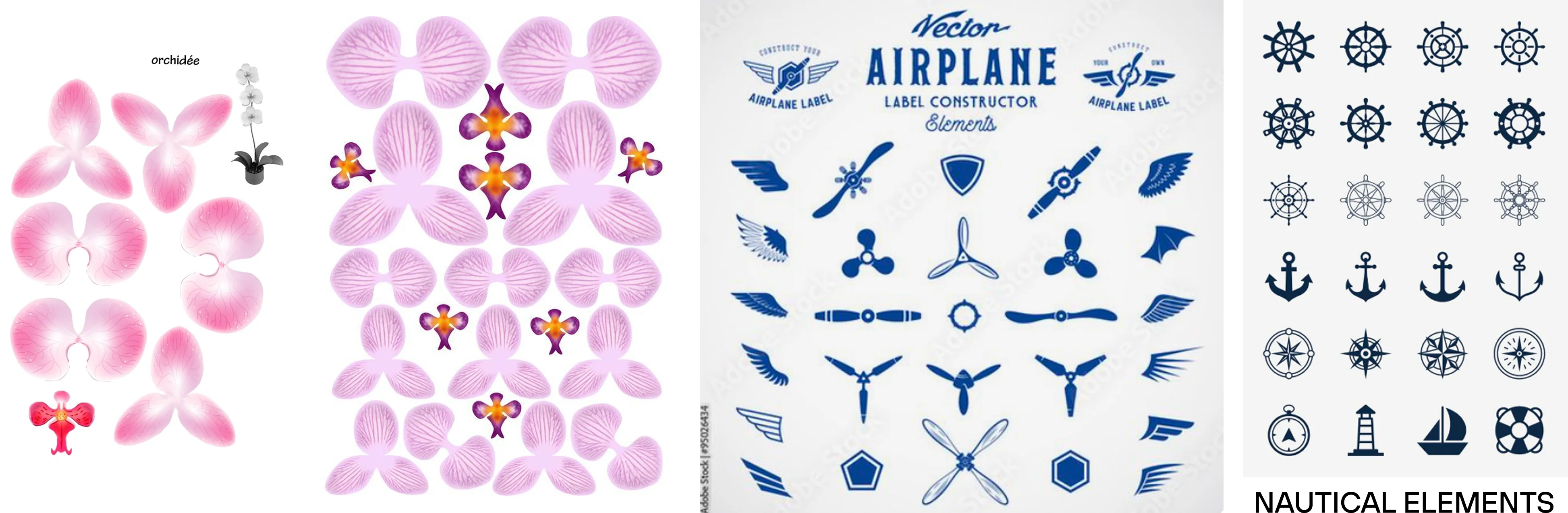
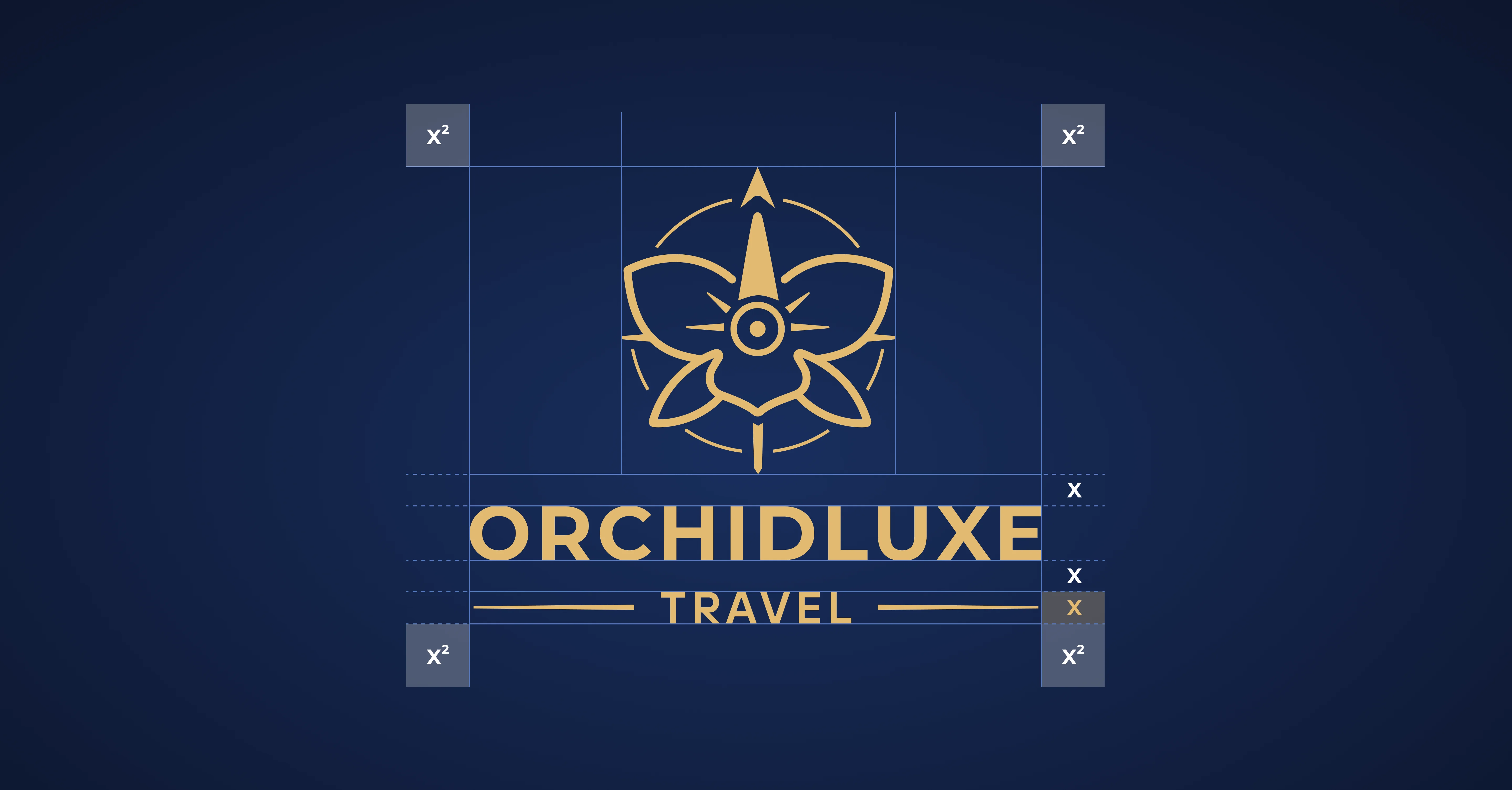
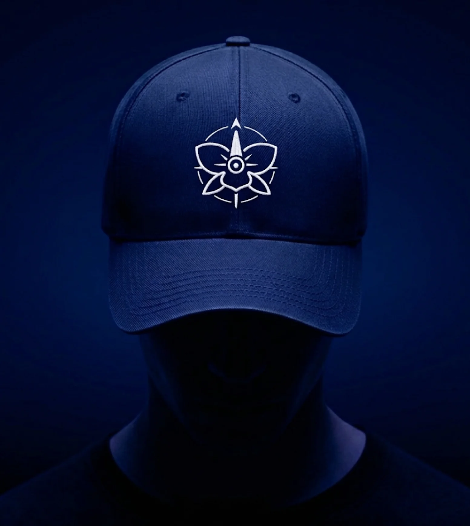
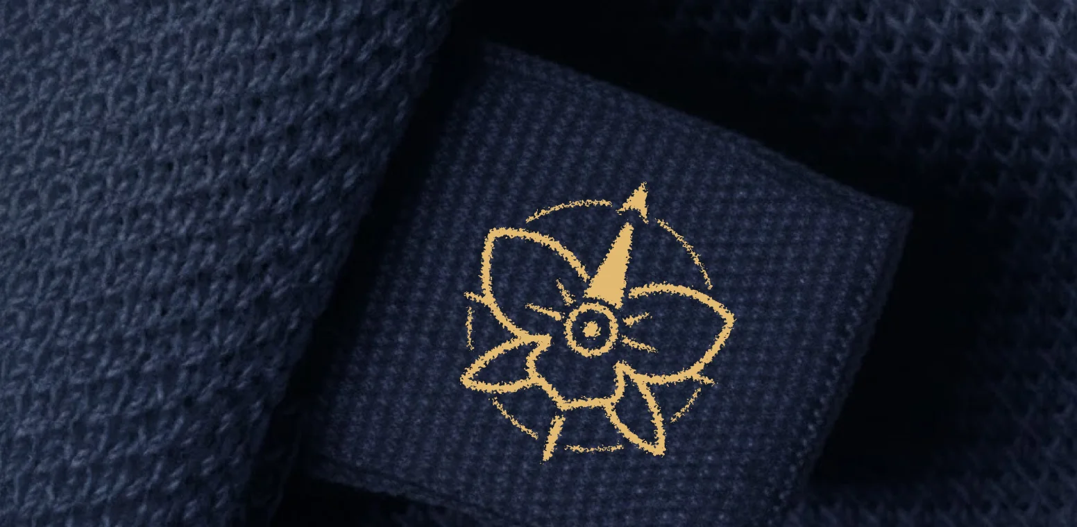
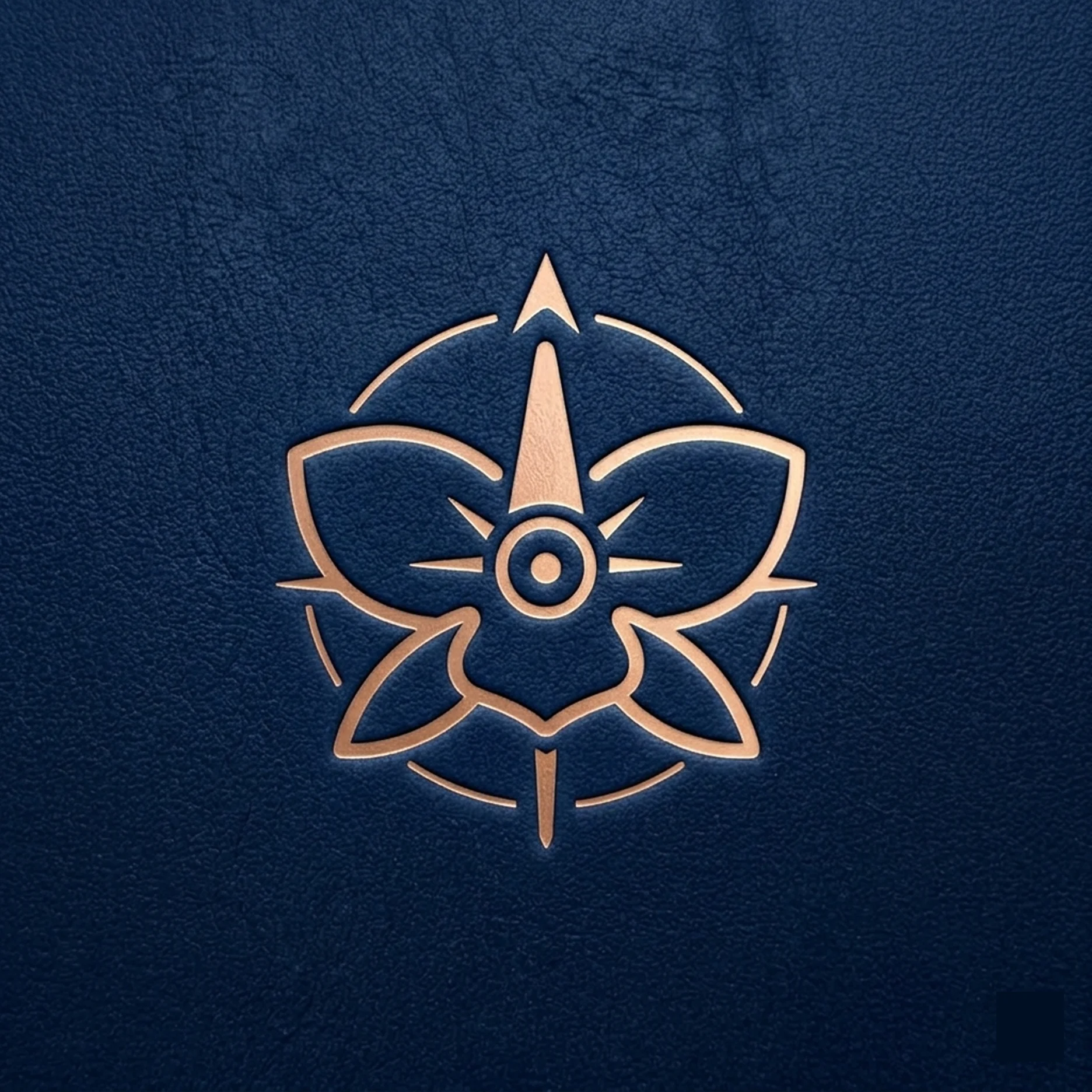
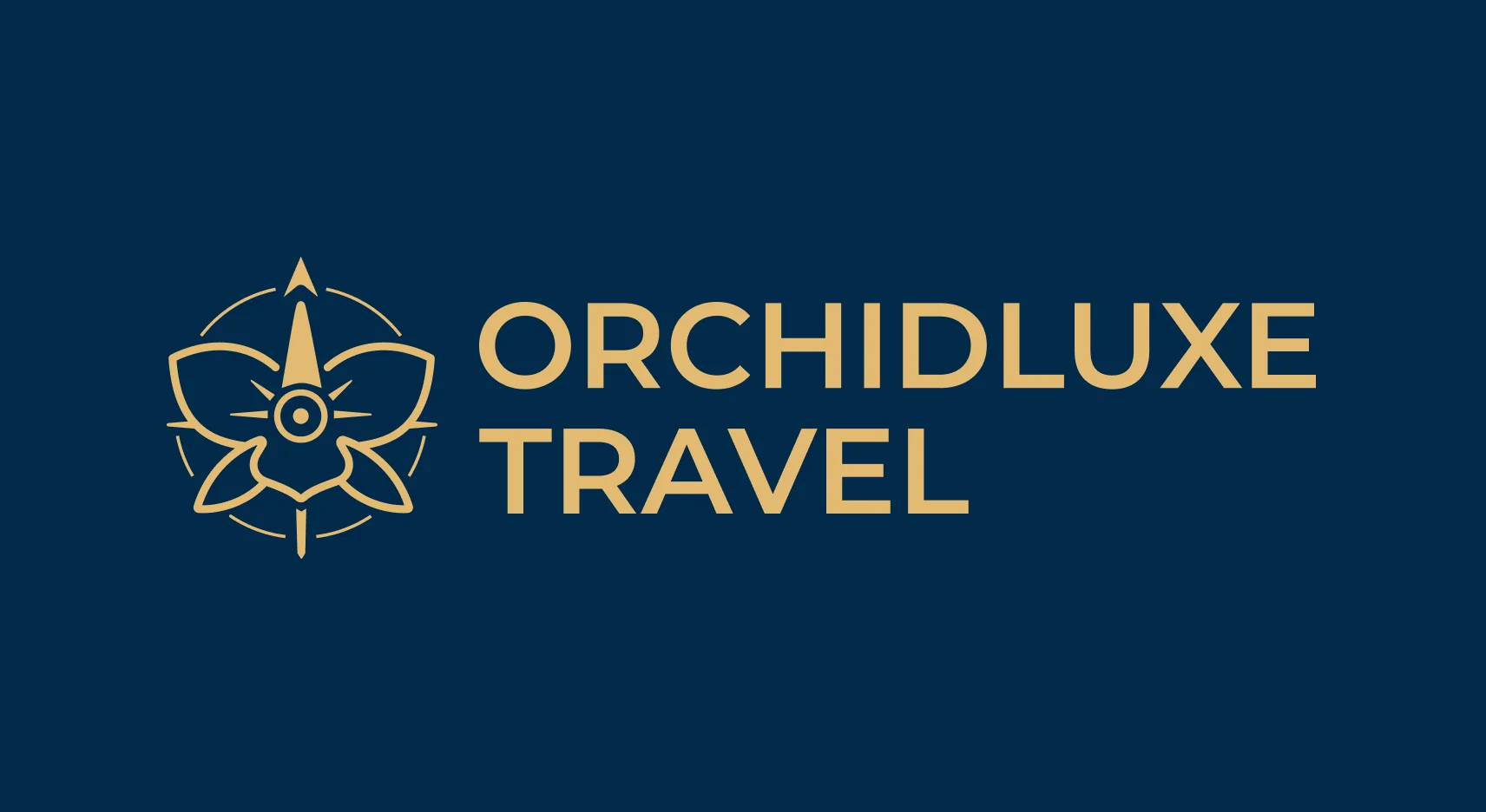
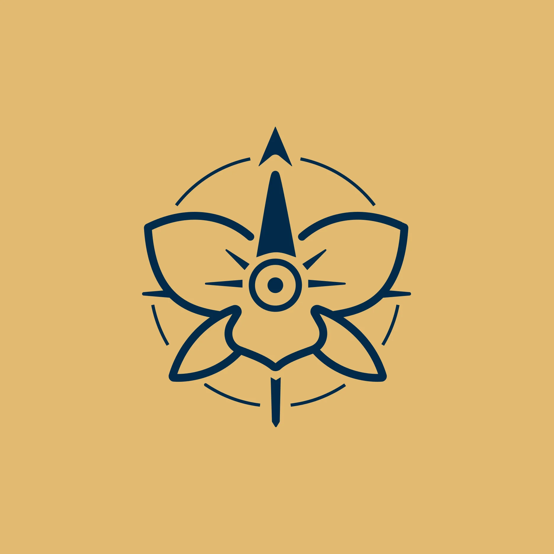
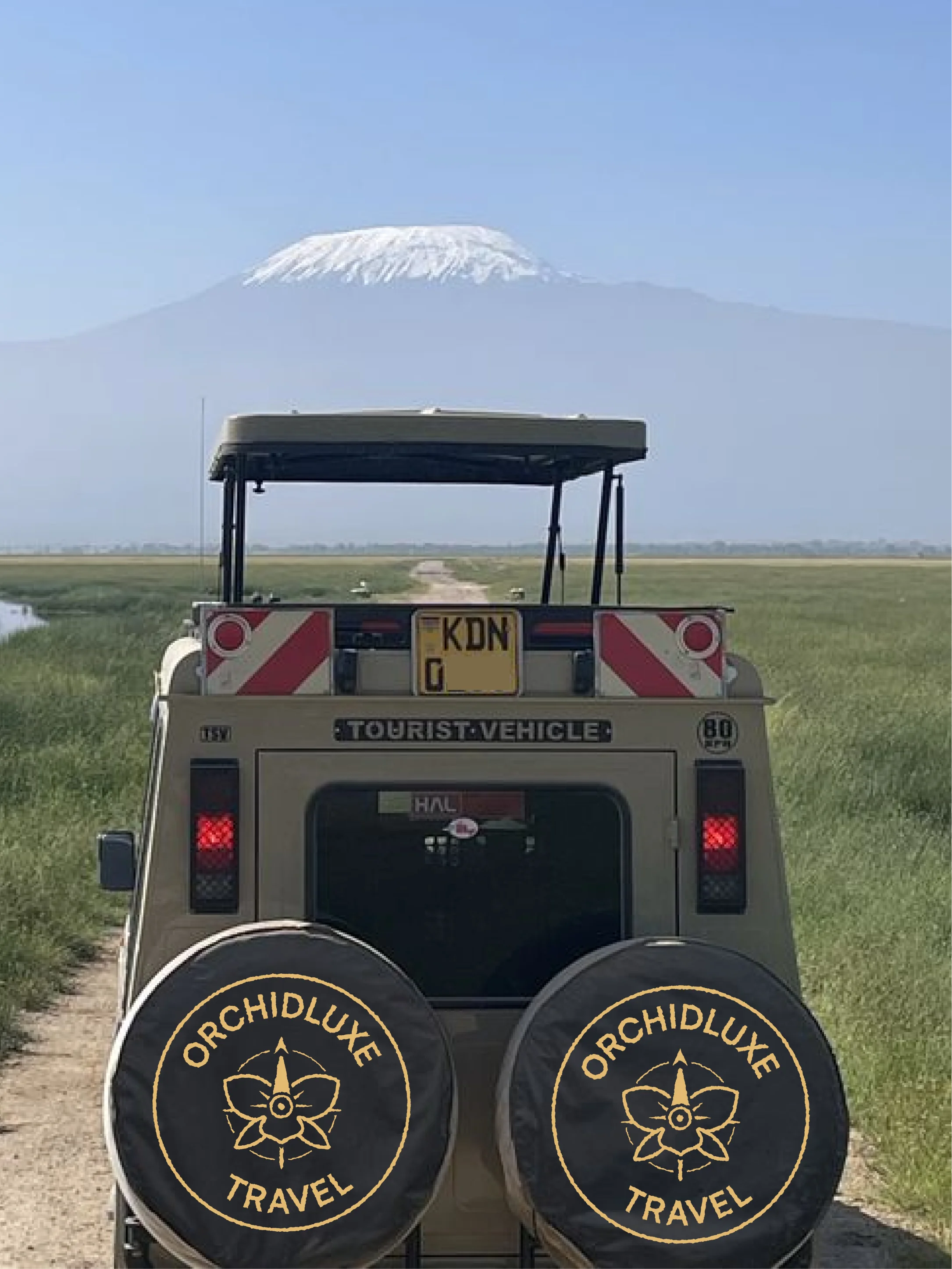
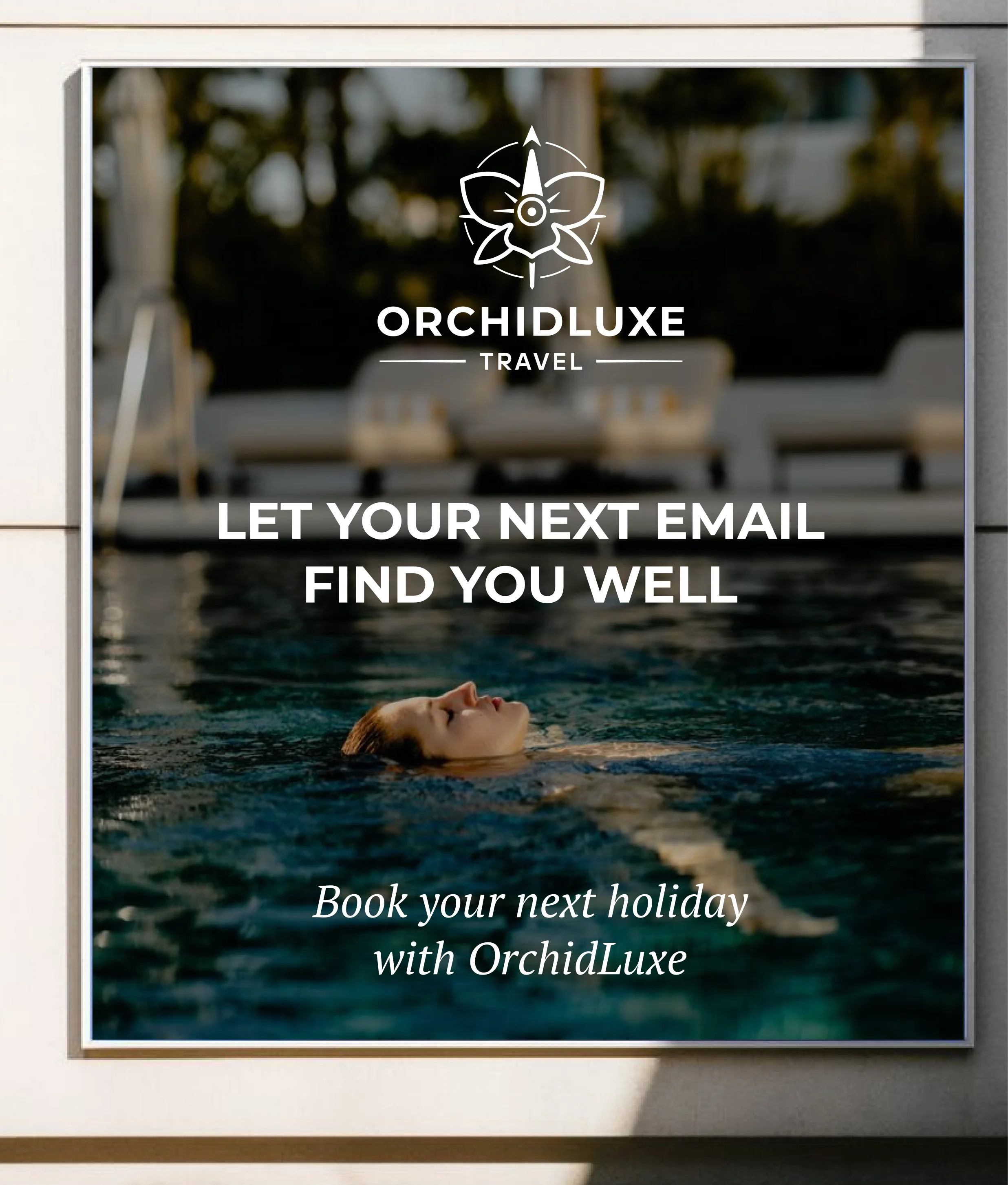
The Orchid Luxe logo is a refined synthesis of an orchid, a compass, and a propeller, brought together to represent curated luxury travel guided by precision and intention.
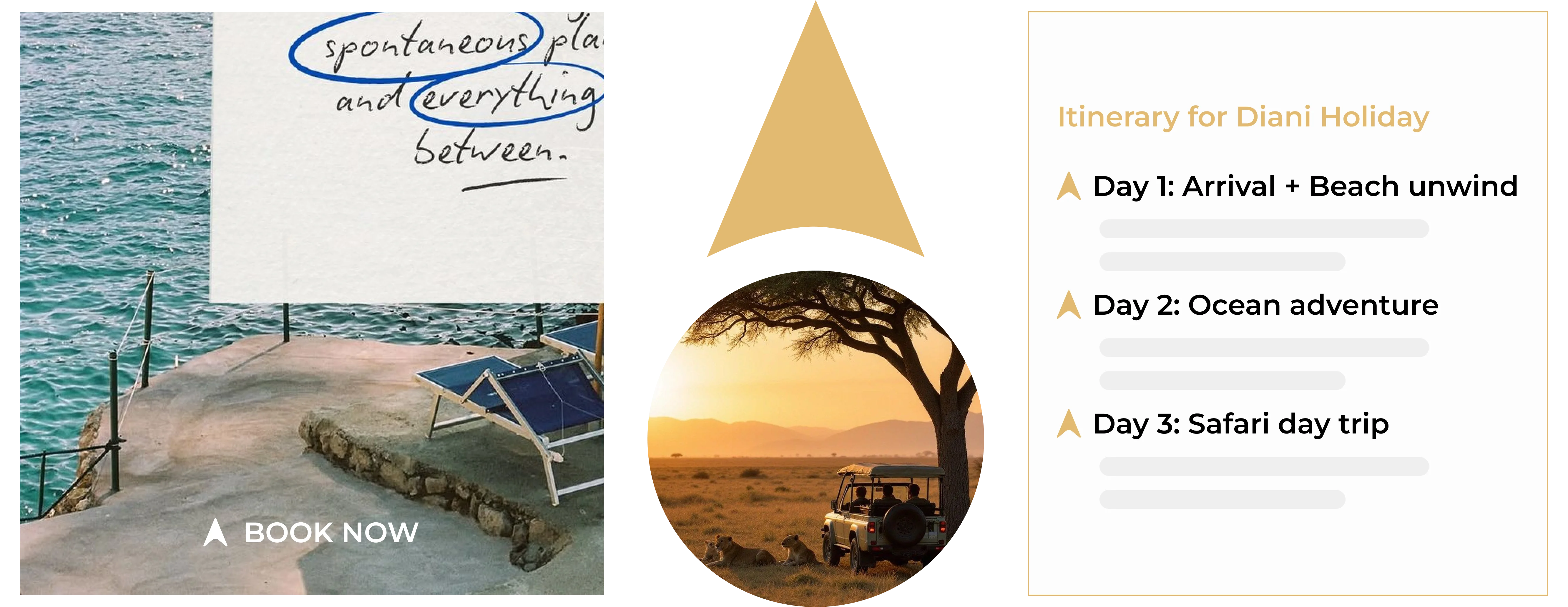
The orchid reflects elegance, rarity, and a premium experience, while the compass emphasizes direction, trust, and expertly planned journeys, with a subtle focus on the north to signify guidance. The propeller element introduces a sense of movement and seamless travel, tying the identity to aviation and exploration.
Together, these elements form a balanced and structured mark that communicates sophistication, discovery, and a commitment to delivering elevated travel experiences.