The Idea
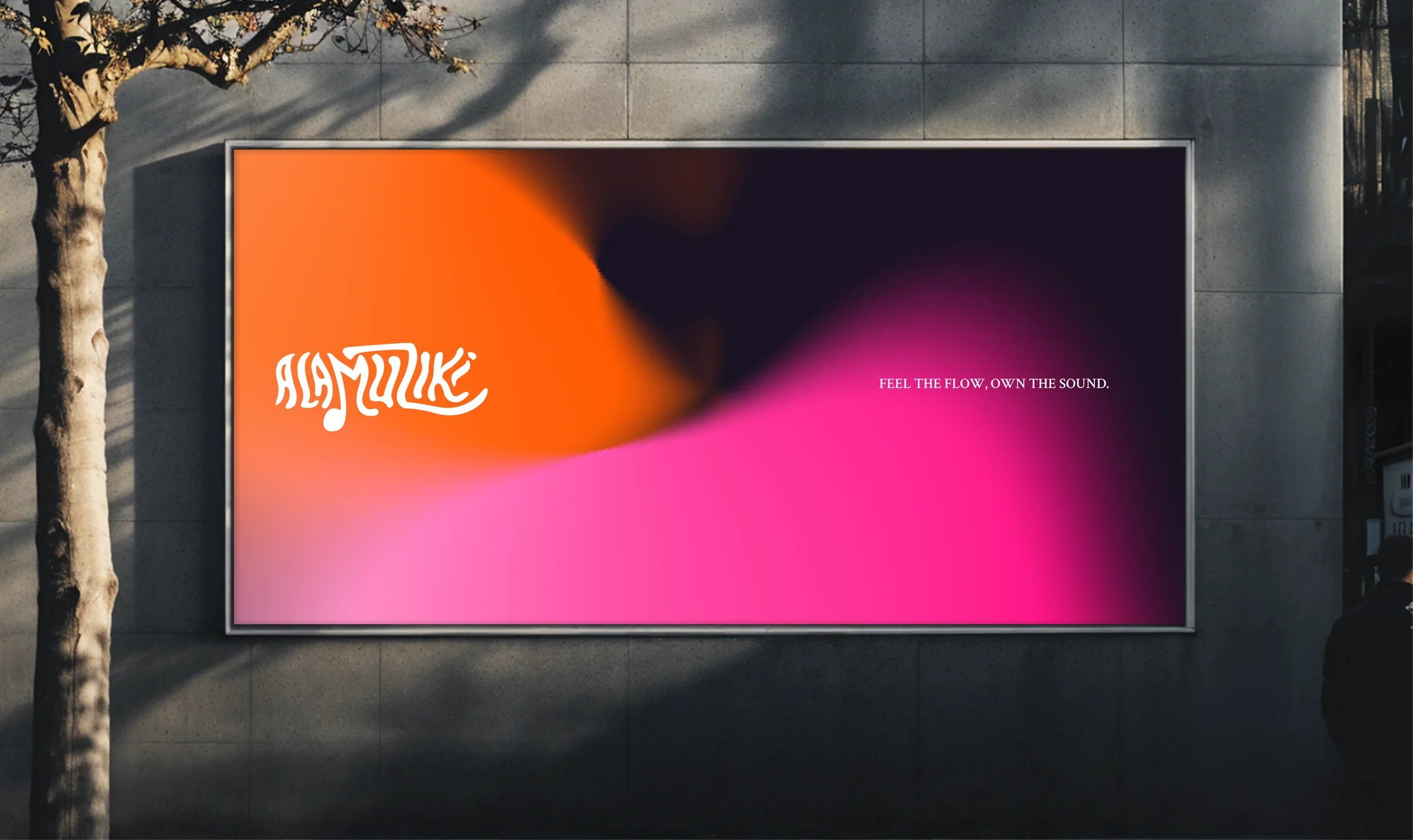
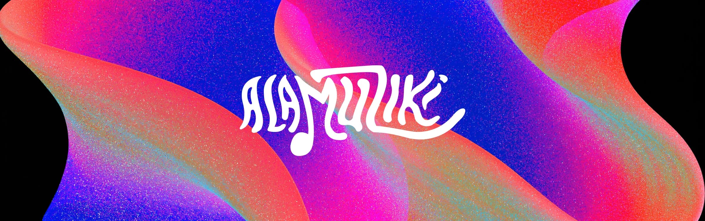
The name comes from two Swahili words: “Ala” (instrument) and “Muziki” (music). But the identity wasn't built from language alone. The logo is rooted in the idea of waves, the way music doesn't just exist as sound, but moves through you. Alamuziki represents the free-flowing nature of music and the creativity that defines it. It is designed to be playful, modern, and expressive. That movement became the visual foundation.
The brief was to be cheerful and poised. Not loud for its own sake, but genuinely buoyant, the kind of energy that belongs to music that makes people feel something.
The Brand
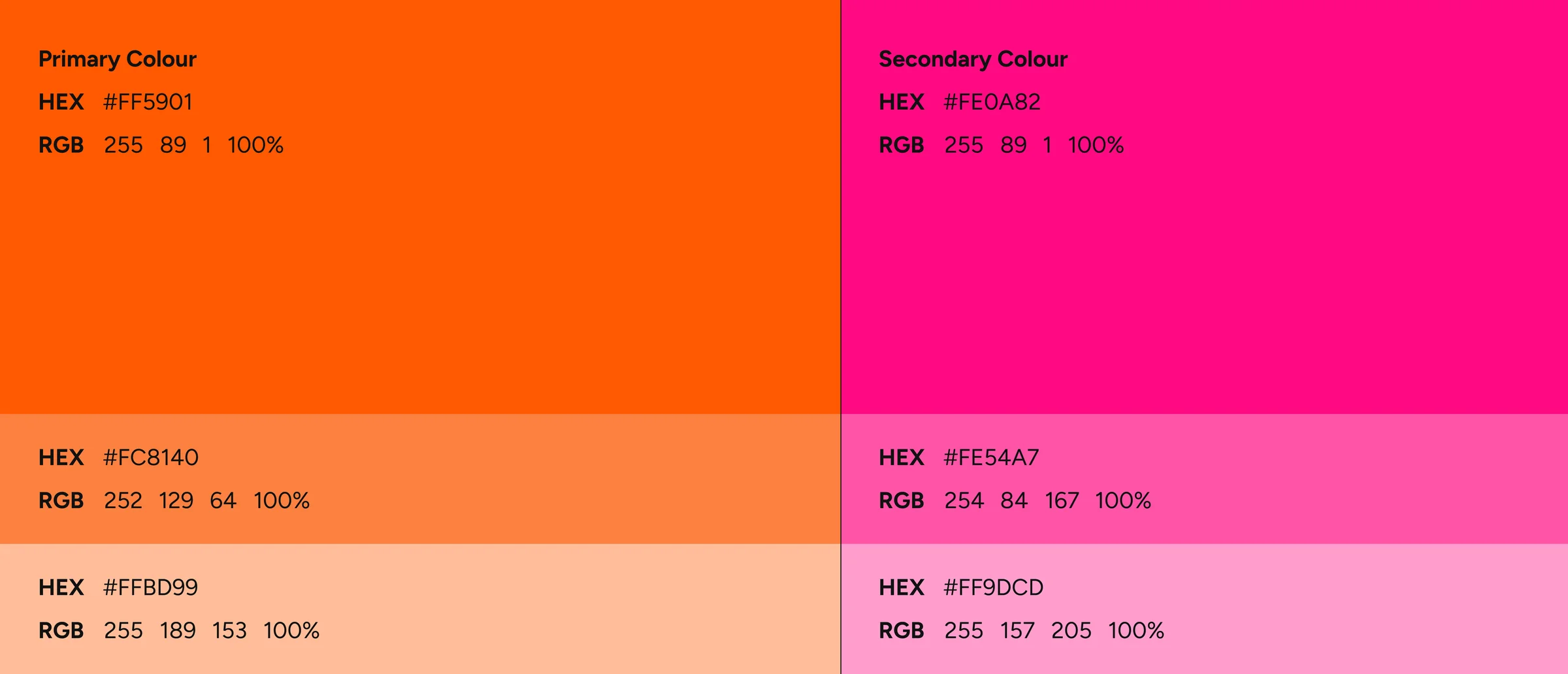
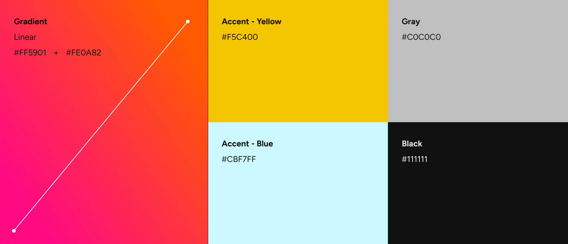
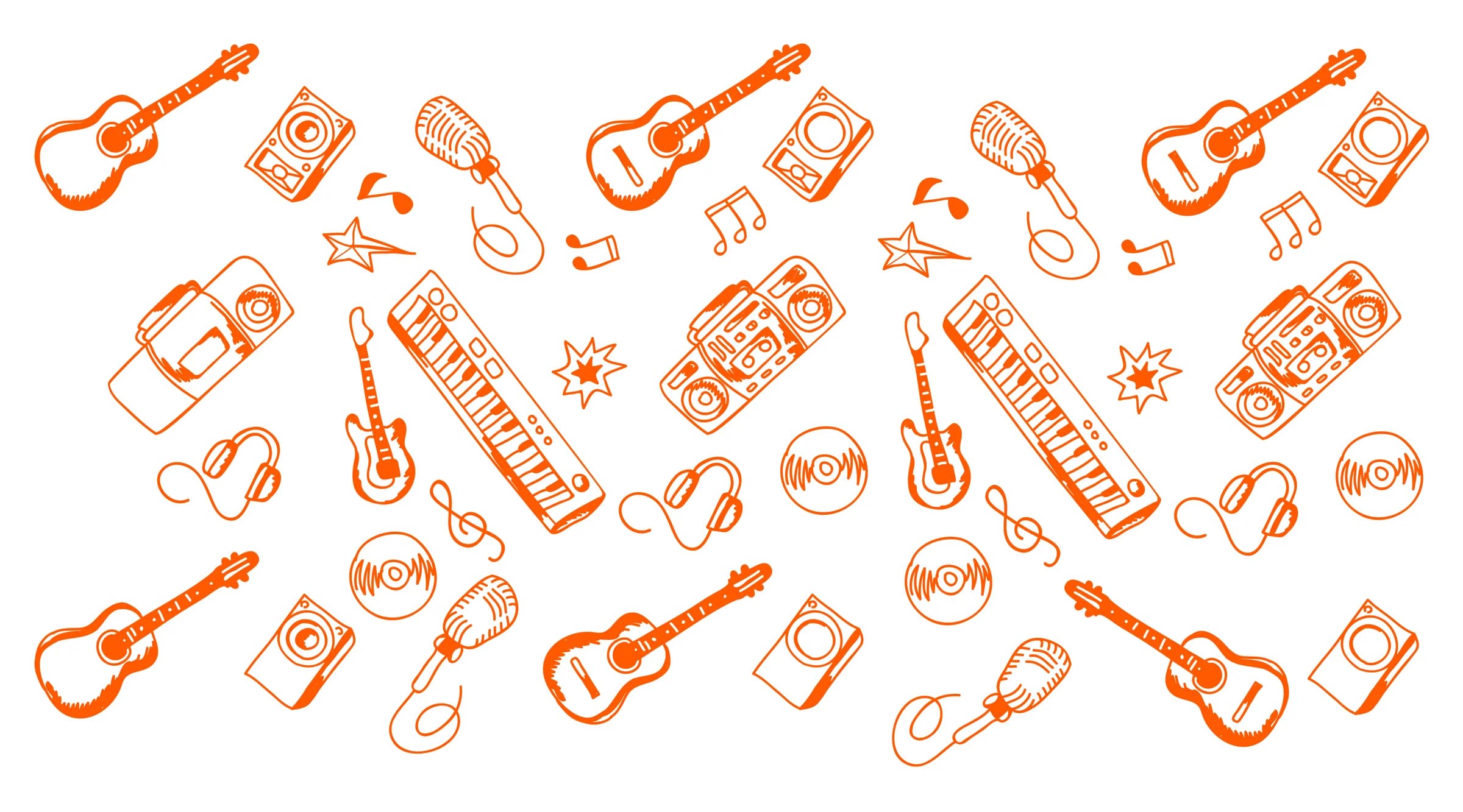
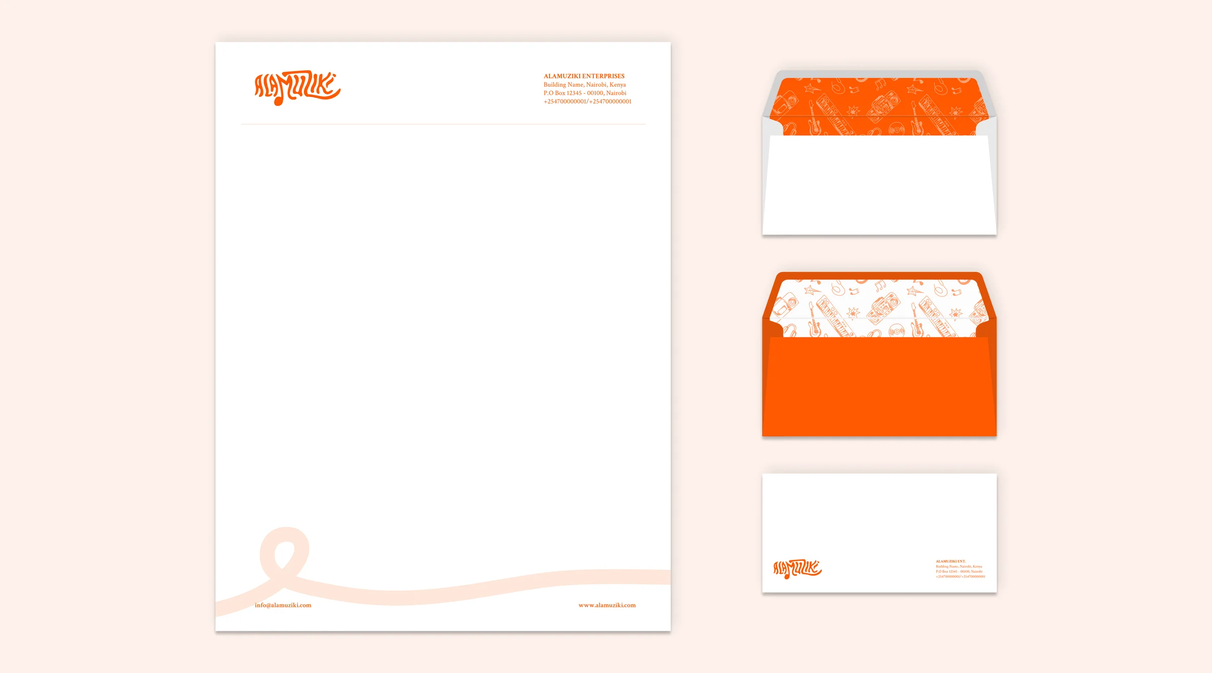
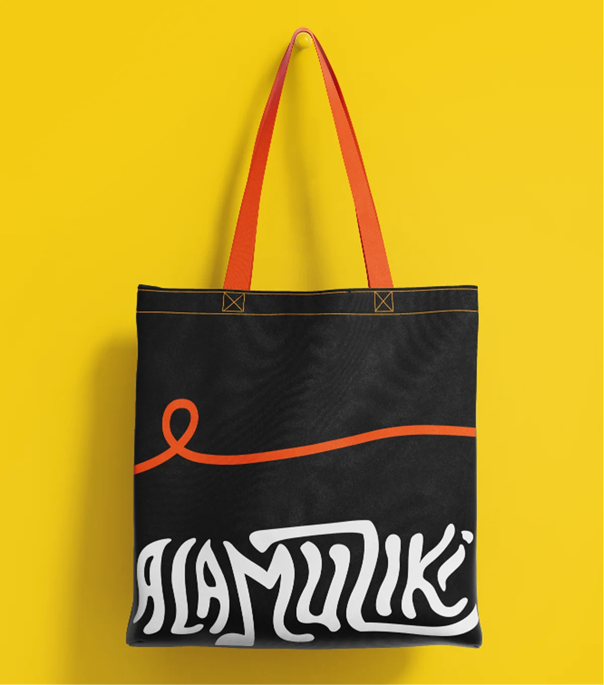
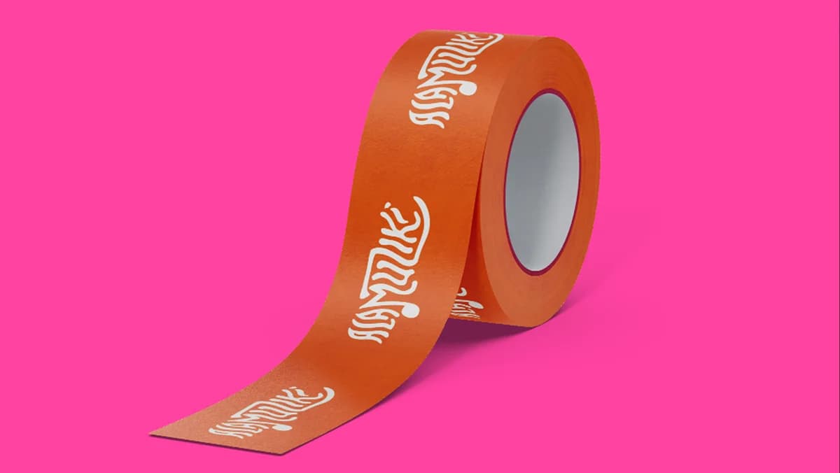
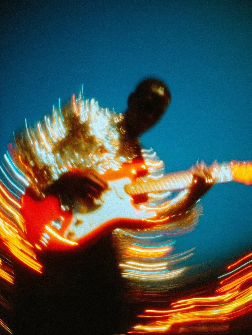
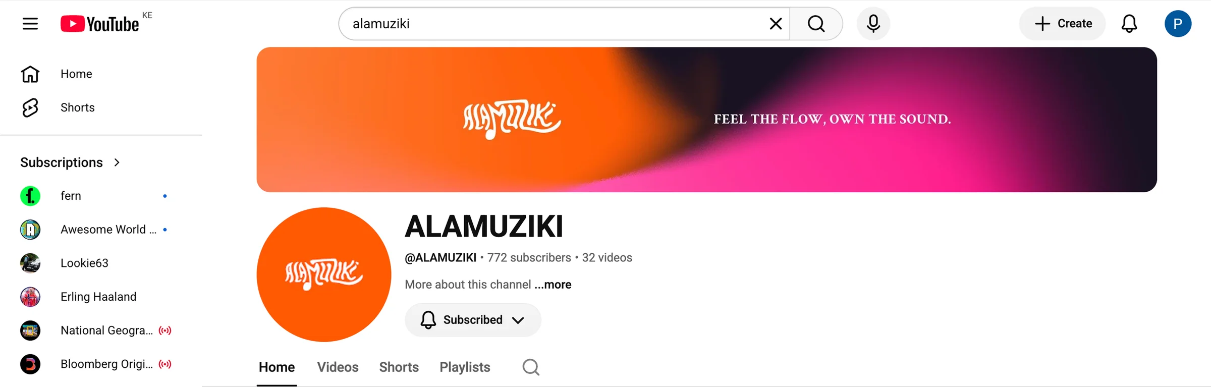
The logo carries the free-flowing nature of music in its form: playful and expressive, designed to move. The full identity extends that character across every touchpoint. The palette is lifted and warm. The typography is fresh without being heavy. The graphic system reflects the same fluidity: forms that bend, compositions that breathe.
Alamuziki's personality is artistic, playful, cheerful, and energetic. A brand that speaks directly to artists with encouragement rather than authority, championing self-expression and the craft behind it.